Making It Real
Phase 11 left the backend hardened, metered and tested – production-ready. The interface was functional but no longer reflected the development rigour of the backend. The quirky UI served me just fine, but I didn't feel it was cohesive enough for real users yet. The biggest issue was the tree view, where multiple floating indicators existed and UI state wasn't clear. It was time to close the distance with V2.
The V2 Workspace
Commits:
Web cd5fff4 – "Add V2 journal workspace with inline editing and squarified AI context toggle" /
Web 85cf843 – "Restructure home page copy and type scale"
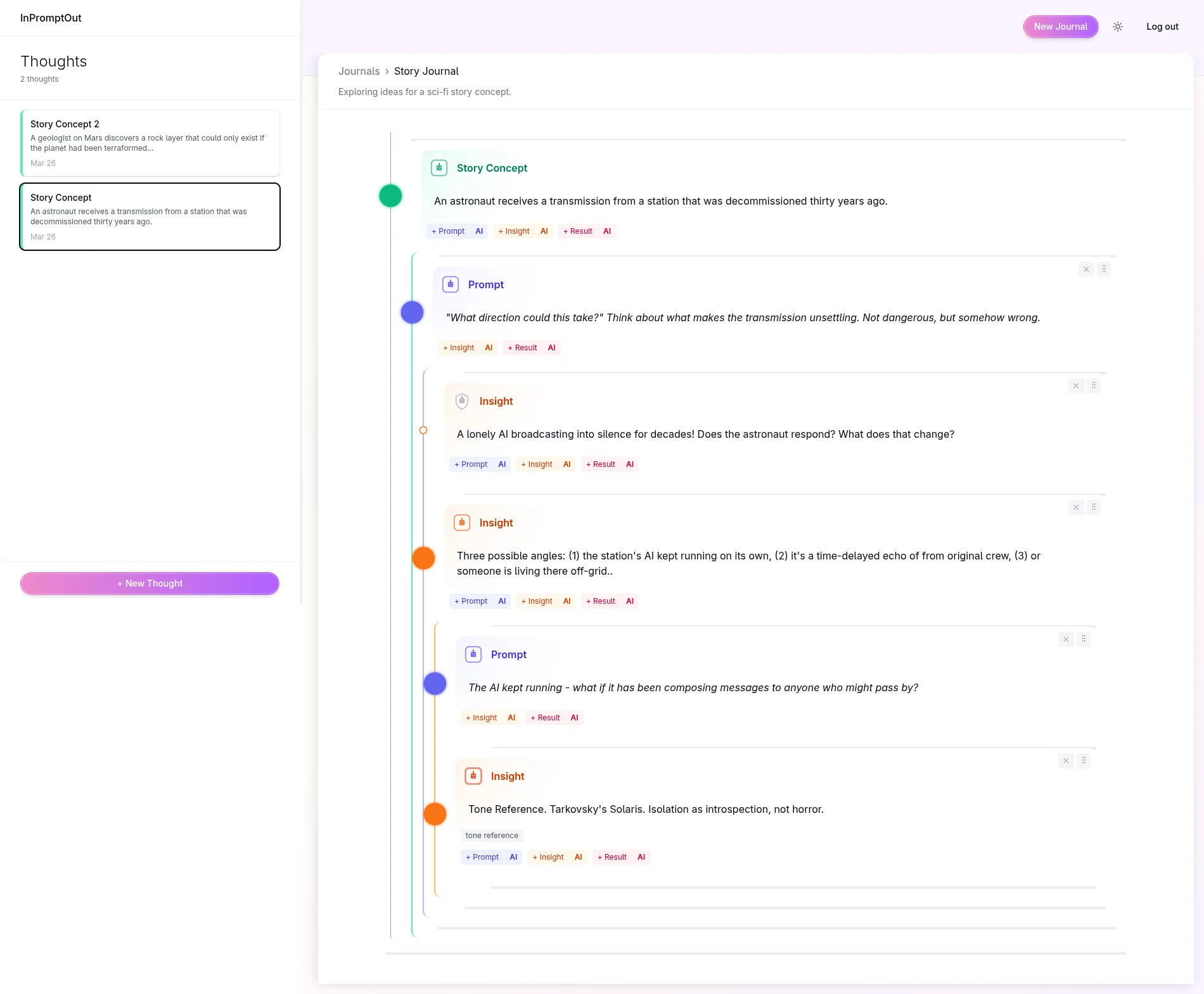
Inline editing replaced separate editing views. Save and status indicators – previously scattered across toasts and a floating bar – moved into the header. V1 layouts were retired.
The Vertical Rail
The visual centrepiece was new: a vertical rail running alongside the tree, with a coloured circle at each node position. Each circle's colour maps to the node type; its size encodes AI weight.
The circle markers came from watching how people give weight to ideas on paper. Whether it is a double-circled point in a mind-map or an underlined item in a list, there is a physical gesture we use to mark something as important. I have noticed this across years of working alongside students and in my own process. The question was how to replicate that instinct in a UI – and, more usefully, how to make that importance signal available to the AI.
Circle size became the answer: a larger circle carries more AI weight. Dragging a circle
vertically adjusts the weight in real time. The implementation uses setPointerCapture
to hold pointer events on the circle element, preventing conflicts with @dnd-kit's own drag
handling on the tree:
1
2
3
4
5
6
7
8
9
10
11
12
13
14
15
16
17
18
19
20
21
22
23
24
25
26
27
28
29
30
const handlePointerDown = useCallback((event: React.PointerEvent) => {
  if (isPrivate) return;
  event.stopPropagation();
  event.preventDefault();

  const target = event.currentTarget as HTMLElement;
  target.setPointerCapture(event.pointerId);

  dragRef.current = { startY: event.clientY, startWeight: activeWeight };
  setIsDragging(true);
}, [isPrivate, activeWeight]);

const handlePointerMove = useCallback((event: React.PointerEvent) => {
  if (!isDragging || !dragRef.current) return;

  const deltaY = dragRef.current.startY - event.clientY;
  const newWeight = Math.max(
    AI_WEIGHT.MIN,
    Math.min(AI_WEIGHT.MAX, Math.round(dragRef.current.startWeight + deltaY * 0.5))
  );
  setLocalWeight(newWeight);
}, [isDragging]);

const handlePointerUp = useCallback((event: React.PointerEvent) => {
  if (!isDragging || !dragRef.current) return;
  event.currentTarget.releasePointerCapture(event.pointerId);
  setIsDragging(false);
  onWeightChange?.(localWeight);
  dragRef.current = null;
}, [isDragging, localWeight, onWeightChange]);
Private nodes are non-draggable and rendered with a white fill regardless of node type – a visual signal that they are outside the AI's view. The backend extension was straightforward: the edge model already carried metadata, so adding a weight field required no structural changes to the data model.
Dark Mode
Commit:
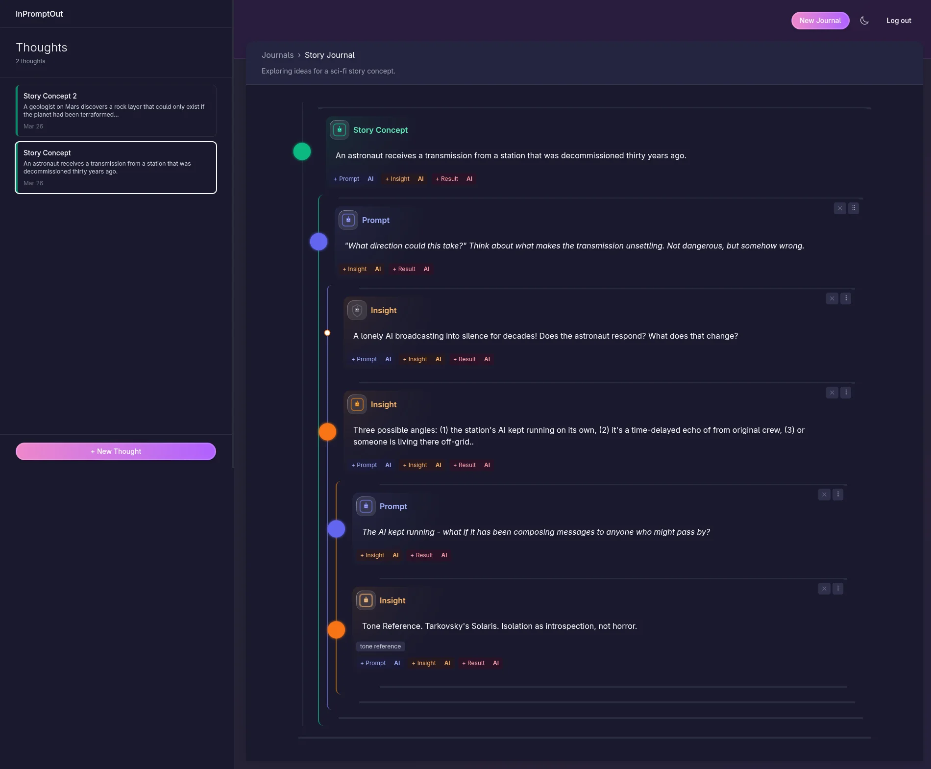
Web 85cf843 – "Add dark mode with theme toggle and semantic color tokens"
Dark mode had been on the roadmap as high-effort work. It shipped in a week. The process:
lightmode screenshots into Photoshop, colour picking until the dark variants felt right,
then those colours into a well-scoped AI prompt – that got the implementation eighty percent
of the way there. The token model in radiant.css made the rest straightforward:
semantic surface and text colours defined in a @theme block, overridden wholesale
under a .dark class on <html>:
1
2
3
4
5
6
7
8
9
10
11
12
13
14
15
16
17
@theme {
  --color-surface: #ffffff;
  --color-surface-secondary: #f9fafb;
  --color-on-surface: #030712;
  --color-on-surface-secondary: #4b5563;
  --color-on-surface-muted: #9ca3af;
  /* ... */
}

.dark {
  --color-surface: #1a1a2e;
  --color-surface-secondary: #252540;
  --color-on-surface: #f9fafb;
  --color-on-surface-secondary: #d1d5db;
  --color-on-surface-muted: #6b7280;
  /* ... */
}
Any component using --color-surface or --color-on-surface gets
dark mode for free. The base is the Tailwind Radiant template, but the design has gone its
own way – both light and dark modes have grown quite distinct from where they started.
Design after engineering
After six weeks of security audits and metering infrastructure – important work, but invisible – the chance to do something visual was genuinely enjoyable. Subtle background animations, careful colour balance across both modes: nothing complex, but a nod to a design and animation background that does not often surface in backend-heavy phases. That's the biggest reason dark mode got done so quickly. The design muscles needed a stretch.
The Landing Page
Commits:
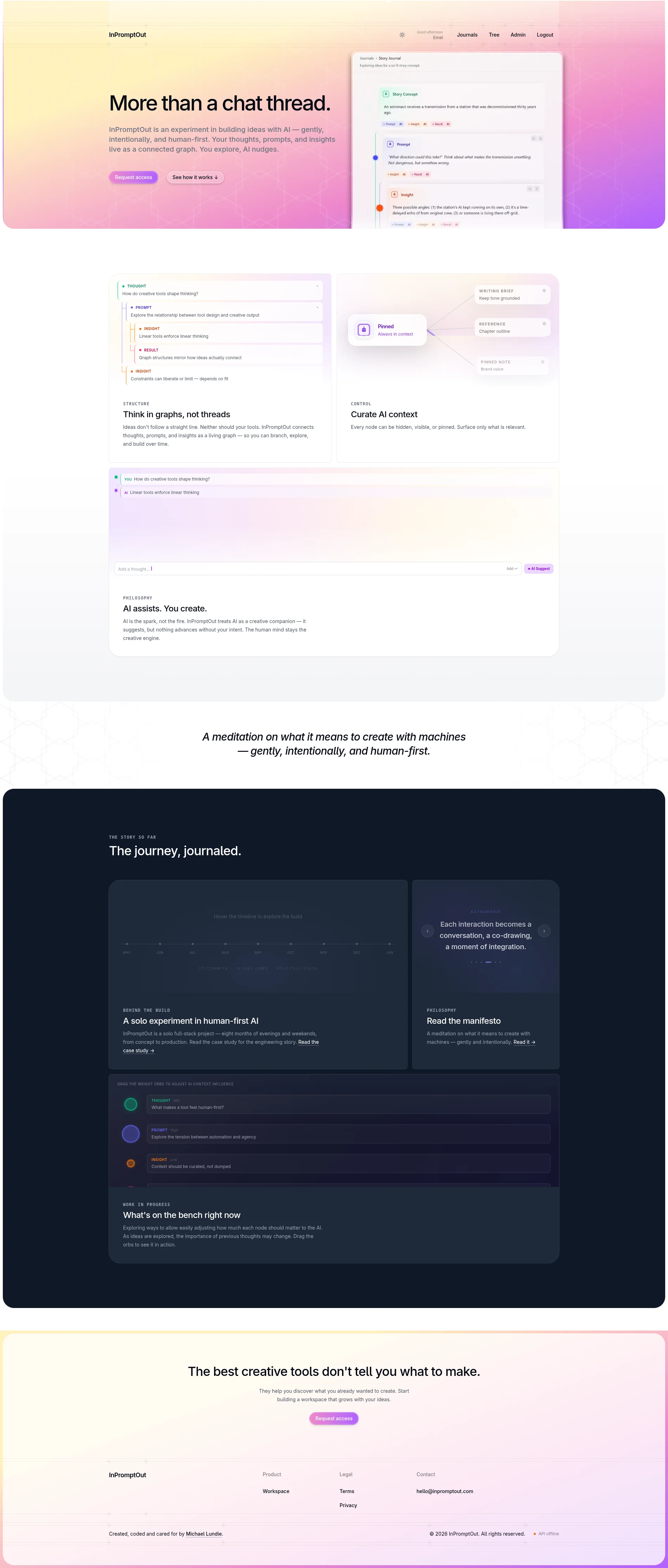
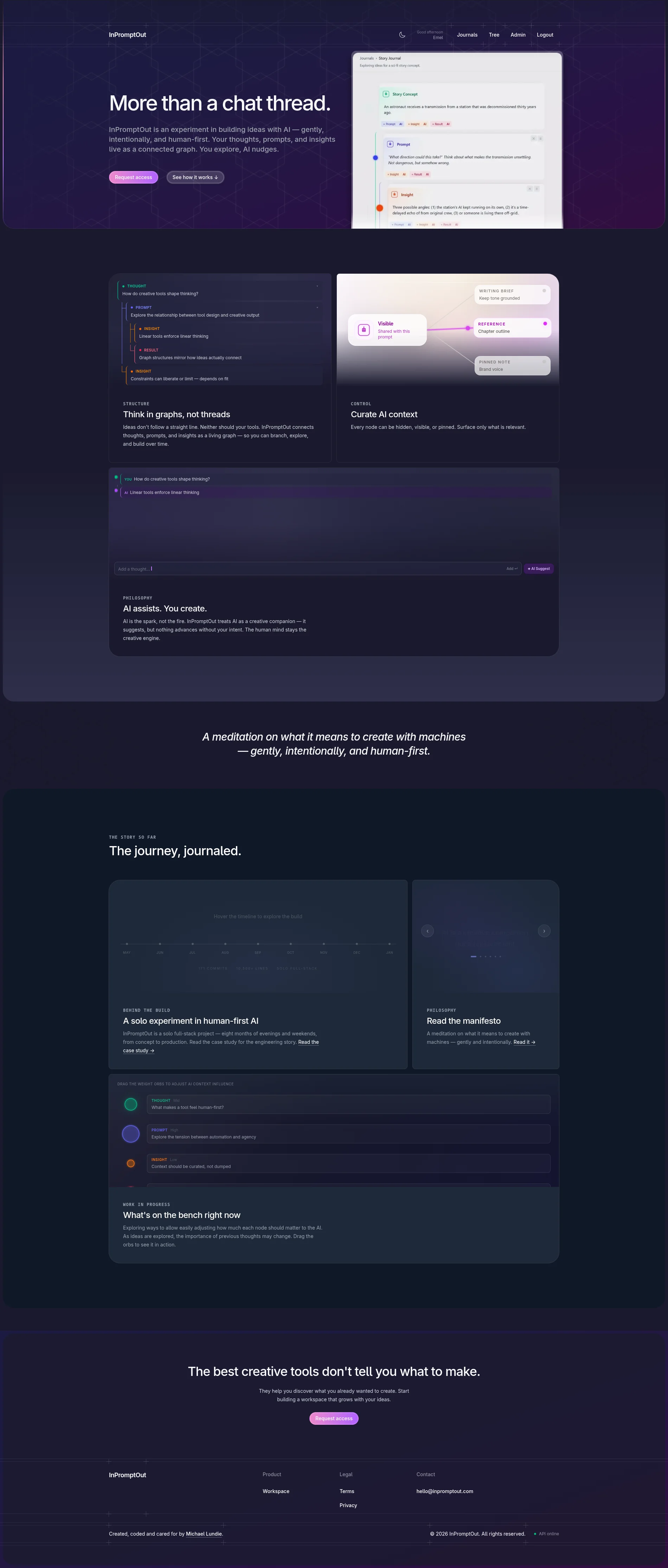
Web 30c819c – "Add landing page visuals and AI context demo" /
Web 014430e – "Replace dark bento placeholders with Behind the Build section" /
Web 895dcec – "Code-split routes, interactive build timeline, bento card fix"
The default approach would have been GIFs or video clips to demonstrate the app on the landing page. The idea that replaced it came while using InPromptOut to plan the landing page itself: what if the callout sections contained actual interactive demos of the app's features rather than recordings of them? There is more to explore with this idea, but it came out well – each demo is a live, functional slice of the UI embedded in the page.
The "Behind the Build" section takes a more straightforward approach: a mini-section on the home page pointing directly to this project history. A portfolio piece with its own build story surfaced in the product landing page – which itself was planned inside the product.
Authentication & Bot Protection
Commit:
Web f70a05e – "Add Cloudflare Turnstile bot protection and Google sign-in"
The final authentication pieces – forgot password, Google sign-in, and mailing list opt-in during the invite flow – completed what had been started in Phase 8. Bot protection used Cloudflare Turnstile rather than reCAPTCHA: a natural fit for the infrastructure stack, and one that adds less friction. The app is invite-only; layering a challenging CAPTCHA on top of that felt unnecessary from a user-facing perspective.
The mailing list opt-in is there for a reason. InPromptOut is in active use – invite-only, experimental, but heading toward a real launch with real users. The data from early usage will inform what comes next.
Deployment & Resilience
Commits:
Web 6d19419 – "Harden Docker/Cloud Run config and add Cloudflare middleware" /
Web 3915b9a – "Add API health status indicator in footer"
The final pre-history commits were production hardening: Docker and Cloud Run configuration tightened, a health status indicator added to the footer, stale token refresh handled after idle periods. Keeping infrastructure costs low on a solo project means running lean – the resilience work was about making that lean configuration transparent to users rather than hiding it.
Where It Stands
InPromptOut is live at inpromptout.com, invite-only and in active use.
A note on the experiment
Building this was also a deliberate test of AI-assisted learning. The viability side worked – AI made it possible to ship substantial code earlier than I would have managed alone. The understanding side is more complicated. My usual route into a new tool is a course followed by months of friction, and the friction is where confidence usually lands. Working with AI shortcuts that route, and the fundamentals I'd normally have built up early were still partial well into the project. Time-to-viability and time-to-working-knowledge are not the same axis, and I'm not convinced AI compresses the second one as much as it compresses the first. A longer write-up of the experiment is coming.
Two things I'd do differently. The first is metering. I was aware of the costs from day one, but I hadn't modelled the "what if it all goes wrong" path – and as the scope grew from prototype to something more substantial, that gap caught up with me. Phase 11 became the time to close it. Next time, the failure-path thinking goes in early, and rate limits and budget caps land alongside the repository and service layers in Phase 3. The tree component is the other one. It works, but it's architectural debt I've grown temporarily comfortable with rather than fixed – the first thing I'd revisit if the schedule opened up.
Invite-only is a holding pattern, not the destination. A few more features need to land before I'd be comfortable treating this as a commercial product. But I'm excited about it, and looking forward to having it in the hands of people I haven't already pitched it to.